Onboarding project | Acko Insurance
Onboarding Teardown: Step-by-Step Analysis
Step 1: Play Store Search ("health insurance")

Screenshot Description: Play Store search results for "health insurance," showing Acko’s app among competitors (Star Health, Care Health, Policybazaar, etc.) with a 4.6 rating, 24 MB size, and 1Cr+ downloads.
- What is Working Well and Why?
- High Visibility: Acko’s app appears in the search results with a strong 4.6 rating and 1Cr+ downloads, building trust and credibility for users looking for a reliable insurance app.
- App Size: At 24 MB, the app is lightweight compared to competitors (e.g., Care Health at 114 MB), appealing to users with limited storage or slower internet.
- Clear Naming: “Buy Health Insurance from ACKO” is straightforward, immediately conveying the app’s purpose, which aligns with user intent (searching for health insurance).
- What is Not Working and Why?
- Lack of Differentiation: The app listing doesn’t stand out visually or descriptively compared to competitors (e.g., Policybazaar’s “Compare & Buy” highlights a unique feature). Users may not understand Acko’s unique value (e.g., paperless, instant claims) at this stage.
- No Visual Appeal: The app icon is generic (purple gradient), lacking a distinct visual identity compared to competitors with more recognizable branding (e.g., TATA AIG’s logo). (Subjective)
- Suggested Improvements and Why They’d Be Better:
- Add a Tagline in the Title: Update the app name to “Buy Health Insurance from ACKO – Instant Claims” to highlight a key differentiator (instant claims), making it more compelling and relevant to user needs (quick, hassle-free insurance).
- Redesign the App Icon: Use a more distinctive icon (e.g., a shield or checkmark symbol) to visually convey protection and trust, helping the app stand out in a crowded list.
- These changes would better capture user attention and communicate Acko’s value proposition early, increasing the likelihood of a download.
- Cognitive Biases:
- Social Proof Bias: The 4.6 rating and 1Cr+ downloads leverage social proof, encouraging users to trust Acko because others have. This is effective but could be amplified with a tagline to reinforce the choice.
- Choice Overload: The long list of similar apps may overwhelm users, leading to decision fatigue. Highlighting a unique feature (e.g., instant claims) could reduce this by making Acko a clearer choice.
Step 2: Play Store App Page

Screenshot Description: Acko’s Play Store page with a 4.6 rating, 3L reviews, 24 MB size, “Install” button, and a description: “Buy Health Insurance with Zero Waiting, No Co-pay, 100% Cashless & Instant Claims.”
- What is Working Well and Why?
- Clear Value Proposition: The description highlights key benefits—“Zero Waiting, No Co-pay, 100% Cashless & Instant Claims”—which directly address common user pain points (delays, hidden costs, complex claims), making the app appealing.
- Trust Signals: The 4.6 rating, 3L reviews, and “Trusted by over 8 crore users” banner build credibility, reassuring users of reliability. & the face of R. Madhavan also builds credibility in a big way, which they have used very well! It's a video highlighting their CVP.
- Lightweight App: The 24 MB size is reiterated, ensuring users with limited storage feel confident about downloading.
- What is Not Working and Why?
- No Immediate Call to Action: While the “Install” button is prominent, the page doesn’t create urgency (e.g., a limited-time offer) to encourage immediate action, which could lead to drop-off if users scroll further and get distracted.
- Suggested Improvements and Why They’d Be Better:
- Add Urgency: Include a limited-time offer (e.g., “Download now and get 10% off your first policy!”) to create a sense of urgency, leveraging the scarcity bias to drive installs.
- Cognitive Biases:
- Anchoring Bias: The “Trusted by over 8 crore users” sets a strong anchor of trust, making users more likely to perceive Acko as a safe choice. This is effective.
- Scarcity Bias: Missing an opportunity here—adding a limited-time offer could tap into users’ fear of missing out, prompting quicker action.
Step 3: App Launch and Notification Permission

Screenshot Description: App launch screen with “Simple. Fast. Paperless.” and a pop-up: “Allow ACKO to send you notifications?” with “Allow” and “Don’t allow” options.
- What is Working Well and Why?
- Clear Messaging: “Simple. Fast. Paperless.” sets a positive tone, aligning with user needs for a hassle-free experience, which builds early trust.
- Permission Request: The notification pop-up is concise and gives users a clear choice (“Allow” or “Don’t allow”), respecting user autonomy and avoiding overwhelm.
- What is Not Working and Why?
- Lack of Context for Notifications: The pop-up doesn’t explain why notifications are useful (e.g., policy updates, claim status), [ps* I understand this is an system prompted permission] which might lead users to decline, missing out on future engagement opportunities & is there a need to show it in the 1st step itself?
- Generic Visuals: The background image (a phone with insurance icons) is functional but doesn’t emotionally engage users or reinforce the app’s value proposition at this early stage.
- Suggested Improvements and Why They’d Be Better:
- Add Context to Notification Request: Update the pop-up to “Allow ACKO to send you notifications for policy updates and instant claim status?” This provides a clear benefit, increasing the likelihood of users opting in by addressing their need for timely information. [ps* I understand this is an system prompted permission]
- Enhance Visuals: Replace the generic background with a more engaging image (e.g., a smiling user receiving a claim confirmation), making the experience feel more personal and reinforcing the value of a hassle-free process.
- These changes would improve user engagement by making the benefits of notifications clear and creating an emotional connection early in the journey.
- Cognitive Biases:
- Default Bias: The “Allow” button is prominent, which may encourage users to opt in by default. However, without context, this could backfire if users feel uninformed.
- Priming Bias: “Simple. Fast. Paperless.” primes users to expect a seamless experience, which is effective but could be undermined if later steps don’t deliver on this promise.
Step 4: Initial Login Screen

Screenshot Description: “Simple. Fast. Paperless. Meet ACKO Insurance.” with options: “Log in with mobile number,” “Log in with work email,” and a link for “Have a corporate health policy?”
- What is Working Well and Why?
- Multiple Login Options: Offering mobile number and work email login caters to different user preferences, reducing friction and making the process inclusive.
- Reinforced Messaging: “Simple. Fast. Paperless.” is repeated, reinforcing the app’s core promise and building consistency in user expectations.
- Corporate Option: The “Have a corporate health policy?” link addresses users with existing policies, ensuring they feel included and can proceed easily.
- What is Not Working and Why?
- Lack of Social Login: There’s no option for social login (e.g., Google, Facebook), which could frustrate users who prefer faster, one-tap login methods, increasing drop-off.
- No Value Reinforcement: The screen doesn’t remind users of the app’s benefits (e.g., instant claims, cashless process), missing an opportunity to keep them motivated to proceed.
- Suggested Improvements and Why They’d Be Better:
- Add Social Login: Include Google/Facebook login options to reduce friction for users who prefer quick sign-ins, improving completion rates by catering to modern login habits.
- Reinforce Value: Add a small tagline below “Meet ACKO Insurance,” such as “Instant Claims, 100% Cashless,” to remind users of the app’s benefits, keeping them engaged and motivated.
- These changes would streamline the login process and maintain user momentum by reinforcing the app’s value.
- Cognitive Biases:
- Choice Overload: Offering multiple login options is good, but without social login, some users might feel limited, leading to decision fatigue. Adding more options could balance this.
- Priming Bias: The repeated “Simple. Fast. Paperless.” continues to prime users for a seamless experience, which is effective but needs to be backed up by later steps.
Step 5: Phone Number Entry

Screenshot Description: “Log in with your phone number” with a field for entering the mobile number (+91 country code pre-filled) and a “Log in” button.
- What is Working Well and Why?
- Simplicity: The screen is clean and focused, with a single task (enter phone number), reducing cognitive load and making it easy to proceed.
- Pre-filled Country Code: The +91 code is pre-filled, saving time for users in India (Acko’s primary market) and reducing friction. (I know Acko only works in India but it's good to have thing)
- What is Not Working and Why?
- No Privacy Assurance: Users entering their phone number might worry about data privacy, especially since this is an early step, and there’s no immediate reassurance (e.g., a privacy link is present but not prominent). People are very scared of the spamming problem, which is especially high for insurance companies.
- Lack of Guidance: There’s no indication of what happens next (e.g., OTP verification), which might make users hesitant if they’re unsure about the process.
- Suggested Improvements and Why They’d Be Better:
- Prominent Privacy Assurance: Move the “Privacy policy” link closer to the input field and add a brief note, e.g., “Your data is safe with us,” to address privacy concerns, building trust at this sensitive step.
- Add Next-Step Guidance: Include a small text below the field, like “We’ll send you an OTP to verify,” to set expectations and reduce uncertainty, making users feel more confident.
- These changes would improve user confidence and clarity, reducing drop-off during this critical step.
- Cognitive Biases:
- Framing Bias: Framing the login as “simple” (via the clean design) is effective, but the lack of clarity on the next step might create anxiety, counteracting the positive framing.
- Default Bias: Pre-filling the +91 code assumes the user is in India, which works for most but might confuse international users (though this is a minor issue given Acko’s market focus).
Step 6: OTP Verification

Screenshot Description: “Your OTP is on its way” with the phone number and fields to enter the OTP, a “Resend OTP in 00:28” timer, and an “Auto-fill code from messages” option.
- What is Working Well and Why?
- Clear Instructions: The screen clearly states the OTP has been sent and shows the phone number, reducing confusion and setting expectations.
- Auto-fill Feature: The “Auto-fill code from messages” option simplifies the process, catering to users who want a seamless experience, especially on mobile devices.
- Resend Option: The “Resend OTP” timer (00:28) provides a fallback, ensuring users don’t feel stuck if they miss the OTP.
- What is Not Working and Why?
- No Visual Feedback: There’s no loading animation or visual cue while waiting for the OTP, which might make users feel uncertain if the system is working.
- Lack of Support Option: If the OTP doesn’t arrive, there’s no immediate support link (e.g., “Contact us”), which could frustrate users who encounter issues.
- Suggested Improvements and Why They’d Be Better:
- Add a Loading Animation: Include a subtle loading spinner or progress bar while the OTP is being sent, providing visual feedback that the system is active, which would reduce uncertainty and improve trust.
- Include a Support Link: Add a “Didn’t receive OTP? Contact us” link below the resend timer, linking to Acko’s 24/7 helpline, to provide immediate assistance and reduce frustration.
- These changes would enhance user confidence and ensure a smoother verification process, reducing drop-off.
- Cognitive Biases:
- Confirmation Bias: Users who expect a seamless process (primed by “Simple. Fast. Paperless.”) may feel reassured by the auto-fill feature.
- Loss Aversion (dislike): The resend timer creates a sense of urgency, tapping into users’ fear of missing out on the OTP, which encourages them to stay engaged & also make sure that they can get another try at it.
Step 7: Name Confirmation

Screenshot Description: “Hey, glad to see you! Please check if we’ve got your name right” with fields showing “Dhruv Dixit” and a “Continue” button.
- What is Working Well and Why?
- Personal Touch: The greeting “Hey, glad to see you!” feels warm and welcoming, creating an emotional connection early in the onboarding process.
- Pre-filled Name: Pre-filling the name (Dhruv Dixit) saves time and shows the app is smart, enhancing the perception of a seamless experience.
- Editable Fields: Users can correct the name if needed, giving them control and ensuring accuracy.
- What is Not Working and Why?
- Lack of Value Reinforcement: The screen doesn’t remind users of the app’s benefits, missing an opportunity to keep them motivated during this step.
- No Skip Option: If users don’t want to share their name or if the pre-filled name is incorrect, there’s no “Skip” option, which might feel intrusive to privacy-conscious users.
- Suggested Improvements and Why They’d Be Better:
- Add a Skip Option: Include a “Skip for now” link below the “Continue” button to give users flexibility, respecting their privacy preferences and reducing friction.
- Reinforce Value: Add a small tagline, e.g., “Let’s get you protected with instant claims!” to remind users of the app’s benefits, keeping them engaged.
- These changes would make the step more user-friendly and maintain momentum by reinforcing the app’s value.
- Cognitive Biases:
- Halo Effect: The friendly greeting and pre-filled name create a positive first impression, making users more likely to view the entire app favorably.
- Commitment Bias: Asking for the name commits users to the process, making them more likely to continue, but a skip option would balance this with user autonomy.
Step 8: Marital Status Question

Screenshot Description: “What’s your marital status?” with options: “Married,” “Unmarried,” “Married and have kids,” “I’d rather not say,” and a “Continue” button.
- What is Working Well and Why?
- Inclusive Options: The range of choices, including “I’d rather not say,” respects user privacy and ensures inclusivity, reducing friction for those who don’t want to share.
- Progress Indicator: The progress bar at the top shows users they’re moving forward, providing a sense of accomplishment and clarity on the onboarding length.
- What is Not Working and Why?
- Privacy Concerns: Asking for marital status might feel intrusive to some users, especially since it’s not immediately clear how this information benefits them (e.g., personalized recommendations).
- Disabled Continue Button: The “Continue” button is greyed out until a selection is made, which might frustrate users who want to skip this step.
- Suggested Improvements and Why They’d Be Better:
- Explain the Purpose: Add a brief note, e.g., “This helps us recommend the best insurance for you,” to clarify why the question is asked, building trust and reducing perceived intrusiveness.
- Enable Skip via Default: Allow the “Continue” button to be active with “I’d rather not say” pre-selected, giving users the option to proceed without sharing, which would respect privacy and reduce friction.
- These changes would make the step feel less invasive and more user-centric, improving completion rates.
- Cognitive Biases:
- Default Bias: The lack of a pre-selected option forces a choice, which might annoy users. Pre-selecting “I’d rather not say” could leverage this bias positively.
- Framing Bias: Framing the question as part of personalization (with a brief note) would make it feel more beneficial, encouraging participation.
Step 9: Insurance Coverage Question

Screenshot Description: “What insurance coverage do you have?” with checkbox options: “Car insurance,” “Bike/scooter insurance,” “Personal health insurance,” “Company provided health insurance,” “Life insurance,” “None of the above,” and a “Continue” button.
- What is Working Well and Why?
- Comprehensive Options: The list covers a wide range of insurance types, ensuring users can accurately reflect their coverage, which helps the app tailor recommendations.
- Checkbox Format: Allowing multiple selections reflects the reality that users may have various types of coverage, making the question practical and user-friendly.
- Progress Indicator: The progress bar continues to provide clarity on the onboarding journey, maintaining user momentum.
- What is Not Working and Why?
- Potential Overwhelm: The list of options might feel long for users who don’t have any coverage or aren’t sure, leading to decision fatigue.
- Lack of Context: There’s no explanation of how this information will be used (e.g., to avoid redundant recommendations), which might make users hesitant to answer.
- Suggested Improvements and Why They’d Be Better:
- Simplify the List: Group similar options (e.g., “Vehicle insurance” for car/bike) to shorten the list, reducing cognitive load and making the step quicker to complete.
- Add Context: Include a brief note, e.g., “This helps us avoid recommending coverage you already have,” to clarify the benefit, building trust and encouraging accurate responses.
- These changes would streamline the process and make the question feel more relevant, improving user engagement.
- Cognitive Biases:
- Choice Overload: The long list might overwhelm users, leading to drop-off. Simplifying the options would mitigate this.
- Priming Bias: The progress bar primes users to feel they’re close to completion, which is effective for maintaining momentum.
Step 10: Personalization Loading Screen

Screenshot Description: “Great! We are personalising your app” with an animation of a hand stacking blocks.
- What is Working Well and Why?
- Visual Feedback: The animation of a hand stacking blocks provides a clear visual cue that the app is working, reducing uncertainty during the loading process.
- Positive Messaging: “Great! We are personalising your app” reassures users that their input (e.g., marital status, coverage) is being used to tailor the experience, building trust.
- What is Not Working and Why?
- Lack of Time Estimate: There’s no indication of how long the personalization will take, which might make users impatient if the process is slow.
- Missed Opportunity for Engagement: The screen doesn’t provide additional value (e.g., a quick tip about the app’s benefits) while users wait, missing a chance to reinforce the app’s value.
- Suggested Improvements and Why They’d Be Better:
- Add a Time Estimate: Include a subtle timer or progress percentage (e.g., “Personalizing… 80%”) to set expectations, reducing impatience and improving user trust.
- Provide a Value Tip: Add a small tip, e.g., “Did you know? Our claims are processed in 24 hours!” to keep users engaged and reinforce the app’s benefits while they wait.
- These changes would make the waiting period more transparent and engaging, enhancing the user experience.
- Cognitive Biases:
- Expectation Bias: The “personalising” message sets an expectation of a tailored experience, which is effective if the next screen delivers on this promise.
- Halo Effect: The positive messaging and animation create a favorable impression, making users more likely to view the app positively.
Step 11: Welcome Screen Post-Account Creation

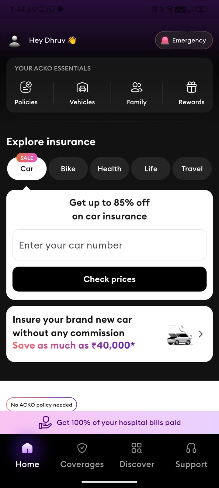
Screenshot Description: “Hey Dhruv! Let’s set up your app real quick” with a “Get started” button, followed by a home screen showing “Your ACKO essentials” (Policies, Vehicles, Family, Rewards) and “Explore insurance” options (Car, Bike, Health, Life, Travel).
- What is Working Well and Why?
- Personalized Greeting: “Hey Dhruv!” continues the personal touch, making the experience feel welcoming and user-centric.
- Clear Next Steps: “Let’s set up your app real quick” with a “Get started” button provides a clear call to action, guiding users smoothly into the next phase.
- Home Screen Overview: The home screen offers a clear dashboard with “Your ACKO essentials” and “Explore insurance” sections, giving users an immediate sense of what they can do (e.g., check policies, explore new coverage).
- What is Not Working and Why?
- No Immediate Value Demonstration: The welcome screen doesn’t showcase the app’s core benefits (e.g., instant claims, cashless process), missing an opportunity to create an “aha” moment early.
- Home Screen Clutter: The home screen has multiple sections (e.g., “Get up to 85% off on car insurance,” “Insure your brand new car”) without clear prioritization, which might overwhelm users who just want to explore their options.
- Suggested Improvements and Why They’d Be Better:
- Highlight a Key Benefit: On the welcome screen, add a tagline, e.g., “Explore insurance with instant claims!” to immediately showcase the app’s value, creating an early “aha” moment.
- Prioritize Home Screen Content: On the home screen, prioritize one key action (e.g., “Explore insurance” section) with a more prominent CTA (e.g., “Find the right coverage now”), reducing clutter and guiding users to the most relevant next step.
- These changes would create a stronger first impression and guide users more effectively, improving engagement and retention.
- Cognitive Biases:
- Halo Effect: The personalized greeting continues to build a positive impression, making users more likely to trust the app.
- Choice Overload: The home screen’s multiple sections might overwhelm users. Prioritizing one action would reduce this and improve focus.
Where Does the “Aha” Moment Occur?
- Current Flow: The “aha” moment is delayed until after account creation (Step 11), when users see the home screen and can explore insurance options. However, this is too late in the process, as users haven’t experienced the app’s core value (e.g., instant claims, hassle-free process) during onboarding.
- Ideal “Aha” Moment: The “aha” moment should occur earlier, ideally at Step 7 (Name Confirmation) or Step 8 (Marital Status Question), by showcasing a tangible benefit. For example, after name confirmation, a message like “Hi Dhruv! Your claims will be processed in 24 hours – let’s get started!” would demonstrate value immediately, making users feel the app’s promise of a seamless experience.
Cognitive Biases Across the Flow:
- Social Proof Bias: Effectively used in the Play Store (4.6 rating, 1Cr+ downloads) and app page (“Trusted by over 8 crore users”), building trust early.
- Priming Bias: “Simple. Fast. Paperless.” primes users for a seamless experience, which is reinforced through clean design but occasionally undermined by lack of clarity (e.g., no context for notifications, OTP wait time).
- Halo Effect: The friendly tone (“Hey, glad to see you!”) and personalized elements create a positive impression, making users more likely to view the app favorably.
- Choice Overload: Present in steps with long lists (e.g., insurance coverage question, home screen), which could be mitigated by simplifying options and prioritizing actions.
- Scarcity Bias: Missed opportunity in the Play Store page - adding a limited-time offer could drive installs. The OTP resend timer leverages this bias effectively.
Summary of Recommendations:
- Early Value Demonstration: Introduce a tangible benefit (e.g., “Claims processed in 24 hours”) at Step 7 or 8 to create an “aha” moment sooner, keeping users motivated.
- Reduce Friction: Add social login, skip options, and clearer context (e.g., for notifications, marital status) to respect user preferences and reduce drop-off.
- Enhance Engagement: Use visuals, time estimates, and value tips during loading screens to keep users engaged and reinforce the app’s benefits.
Brand focused courses
Great brands aren't built on clicks. They're built on trust. Craft narratives that resonate, campaigns that stand out, and brands that last.


All courses
Master every lever of growth — from acquisition to retention, data to events. Pick a course, go deep, and apply it to your business right away.


Explore courses by GrowthX
Built by Leaders From Amazon, CRED, Zepto, Hindustan Unilever, Flipkart, paytm & more
Course
Advanced Growth Strategy
Core principles to distribution, user onboarding, retention & monetisation.
58 modules
21 hours
Course
Go to Market
Learn to implement lean, balanced & all out GTM strategies while getting stakeholder buy-in.
17 modules
1 hour
Course
Brand Led Growth
Design your brand wedge & implement it across every customer touchpoint.
15 modules
2 hours
Course
Event Led Growth
Design an end to end strategy to create events that drive revenue growth.
48 modules
1 hour
Course
Growth Model Design
Learn how to break down your North Star metric into actionable input levers and prioritise them.
9 modules
1 hour
Course
Building Growth Teams
Learn how to design your team blueprint, attract, hire & retain great talent
24 modules
1 hour
Course
Data Led Growth
Learn the science of RCA & experimentation design to drive real revenue impact.
12 modules
2 hours
Course
Email marketing
Learn how to set up email as a channel and build the 0 → 1 strategy for email marketing
12 modules
1 hour
Course
Partnership Led Growth
Design product integrations & channel partnerships to drive revenue impact.
27 modules
1 hour
Course
Tech for Growth
Learn to ship better products with engineering & take informed trade-offs.
14 modules
2 hours
Crack a new job or a promotion with ELEVATE
Designed for mid-senior & leadership roles across growth, product, marketing, strategy & business


Learning Resources
Browse 500+ case studies, articles & resources the learning resources that you won't find on the internet.

Patience—you’re about to be impressed.